The Arc Animal Sanctuary
A Website Redesign to Optimize Engagement + Support
The Process
Research
Plan
Design
Prototype
Test
Design for Mobile
Going Forward
Duration
April – June 2023
My Role
Rsearch
UX/UI Design
Wireframes
Mockups
User Testing
Prototyping
The Project
The aim of this project was to redesign the website for The Arc Animal Sanctuary to optimize accessibility and engagement across all devices, and to support the sanctuary’s mission of care and rehoming (when possible) services, with capabilities for accepting donations to provide for the needs of all those who find themselves in care of The Arc.
*This case study was created for a course assignment and was not commissioned by the sanctuary, but the organization is real.
Research
To help identify key elements for the new design I conducted a competitive audit of seven animal welfare groups in the same region as The Arc, and a survey of people’s experiences making donations online. Through this research I was able to better understand what kind of information people are looking for and how they make decisions about donating, while also observing the similarities and differences among the animal welfare websites, such as: how they tell their stories, what their commitment is and the impact they have.
User Survey Findings
100% of people expressed a desire to know more about who they are donating to -social media presence, accreditation, and testimonials were all cited as helpful.
86% of people surveyed have made donations online.
68% of people prefer to choose how their donation will be used.
71% of people prefer to enter a custom amount for donation rather than choose from suggested amounts.
28% of people make donations ‘Frequently. Several times per year.’
28% have one or more charitable subscriptions through which they donate automatically/regularly.
All participants agree that it is just as important to have a ‘general fund’ as it is to have specific / categorized funds.
Competitive Audit Findings: Drawbacks
Some of the websites don’t provide enough information about the rescue or its work. At the same time: donation info (bank numbers) are posted repeatedly.
On one website the link to the related business takes you away from sanctuary website with no clear path to return.
Competitive Audit Findings: Information
5 out of 7 sanctuaries provide thorough and detailed information about their mission/work on their website.
Multiple suggestions for ways to help are offered: donate, purchase from wishlist, named partner businesses, volunteer.
5 out of 7 sanctuary websites use a ‘casual friendly’ tone. 1 out of 7 uses a ‘serious educational’ tone.
1 out of 7 sanctuaries is run alongside (in connection to) a small business (hospitality).
Competitive Audit Findings: Appearance
7 out of 7 sanctuary websites display a logo. 6 out of 7 have clear branding + a consistent color palette.
Most websites show a lot of personal touches such as candid photos + quotes from the founder.
General tone across all: personable, friendly, kind, vaguely ‘spiritual’. More serious information comes across as necessary + informative.
Planning
The website for the Arc Animal Sanctuary serves mainly as a portal for adoption and fundraising. It’s important for the website to clearly and thoroughly illustrate the work being done with all of its nuances and challenges and to provide relevant information.
The website needs to tell the story of the sanctuary -how it came to be, how it operates day to day. Information + transparency build trust.
Donations: people want multiple fundraiser options: food pantry, vet bill, etc AND a general fund.
Add thematic candid photos to web pages.
Add themed galleries to show the scope of work: feral colonies cared for by the Arc, a Rainbow Bridge memorial gallery.
Use real quotes: from the founder (great storyteller), from volunteers, from followers (comments, shares, etc).
Keep the color palette but check for accessibility (contrast).
Embed The Dodo videos about the Arc, these are a great help telling the story and provide recognition from a trusted group.
Avoid sending people away from the website (via links, etc). When sending them to supporting websites (shops, socials, etc) the link should open a new window/tab.
Information Architecture
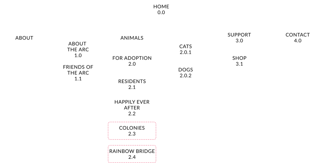
In addition to the galleries featuring resident animals, adoptable animals, and animals who have successfully been adopted into forever homes, the sitemap shows two additional galleries for ‘Colonies’ and ‘Rainbow Bridge’. In the ‘About’ section there is a new page for profiles of local businesses that provide support to the sanctuary, such as lines of credit to help them sustain during times when they’re low on funds –this enables people to make donations as direct payments to businesses which provide supplies and services to The Arc, and also serves as a courtesy promotion for the business.
Wireframes
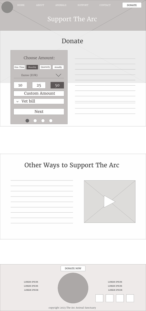
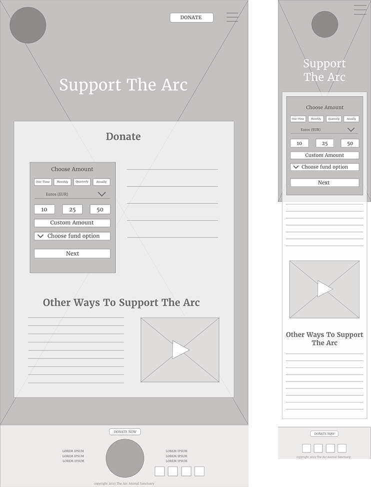
The overwhelming response in my survey was that people want to have a choice about how their donations are applied. In the first screen of the donation processing design donors can choose from a list of fundraising options such as: food pantry, vet bill, and specific short term fundraisers for targeted needs that frequently arise.
Design for Desktop
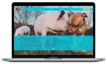
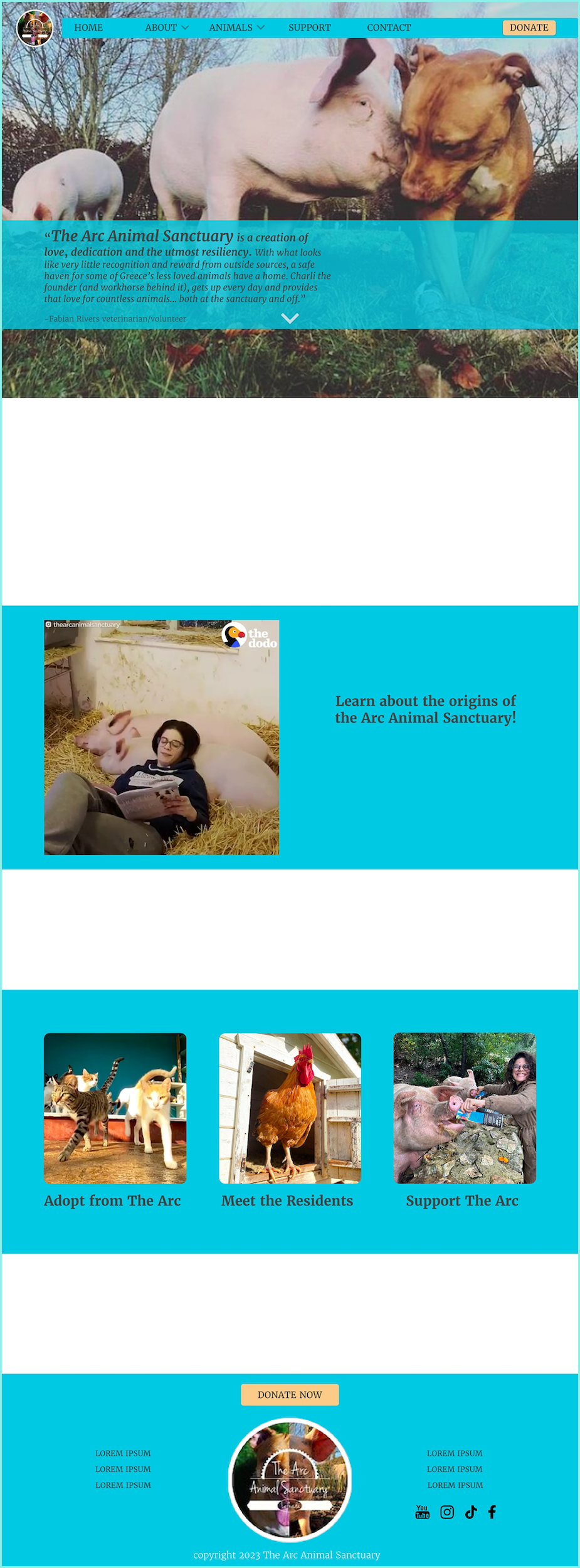
On the home page the name of the sanctuary is in a larger font size as part of a quote from a volunteer. His words provide an introduction to the work done by the sanctuary.
The image for the home page was chosen because of the direct correlation to the sanctuary’s logo which was inspired by these residents.
Each page of the website is anchored by a full-screen fixed background image depicting daily life in and around the sanctuary.
Page elements are positioned over blue panels which are spaced to allow views of the background image as you scroll.
The most important pages are featured with video or images on the home page: about the sanctuary, adoptable animals, resident animals, and how to support the sanctuary.
In the footer you have navigation options, a large call to action button, and all of the social media links.
To view a mock-up of the new design follow this link.
Design for Tablet
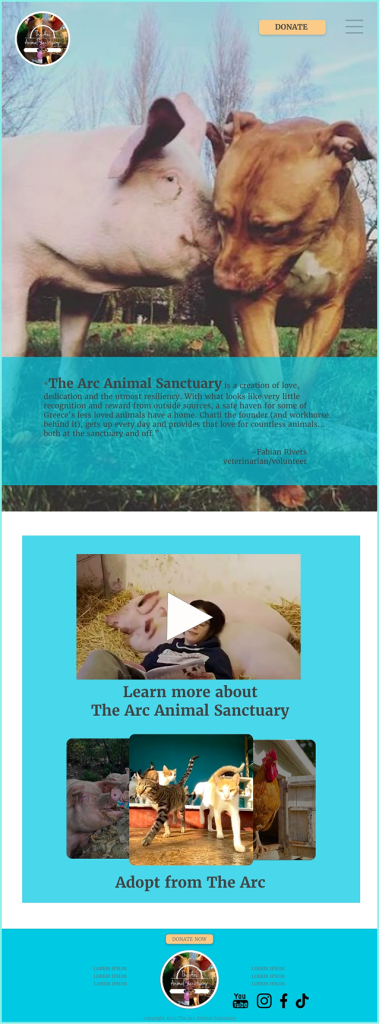
The design scaled to tablet is not so different from the desktop version:
The background image has been cropped to fill the screen in portrait orientation.
Page elements are positioned on blue panels which pass over the fixed background.
The three images that link to important pages are now arranged in a carousel to compensate for the reduction in screen width.
Design for Phone
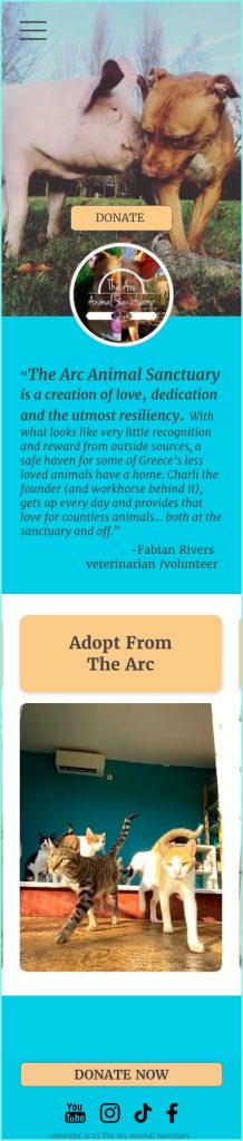
Significant differences can be seen in the phone layout:
The logo and CTA button have been brought to the center of the home screen.
Because the size of the background image cannot be made to fill the entire length of a phone screen in portrait orientation, the image disappears completely as you scroll down.
All of the interactive elements on the home screen are now in one single slider carousel.
The footer now contains only the call to action and the social media icons.
Takeaways
Increasing engagement through the redesigned website has the potential to make a meaningful difference for the sanctuary. When its needs are met—or even exceeded—the organization can invest in facility improvements and launch new programs. By building fundraising features that offer donors transparency and choice in how their contributions are used, the redesign supports more effective and sustainable giving.
*This case study was created for a course assignment and was not commissioned by the sanctuary, but the organization is real. The designs created for this project were offered to them as a donation to use all or parts of, if they so choose.
Thank you for exploring the details of this project. If you’d like to discuss how we can bring your ideas to life,
schedule your consultation now.