“Isla Mare is a quiet resort on the coast. It offers warm service, beautiful views, and a calm place to unwind. Isla Mare appeals to families, couples, and travelers who want a peaceful stay with good food, sun, and space to breathe.”

(From the Isla Mare design brief offered by Brief Corp)
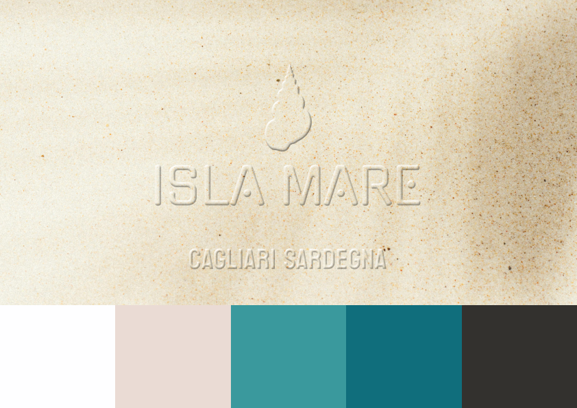
sand with the faint shadow of a palm frond falling across it, the words 'ISLA MARE, CAGLIARI SARDEGNA' are embossed in the sand, across the bottom of the image there are five colored squares representing the color palette chosen for this brand identity

white sand
#fefeff
rgb(254,254,255)
hsl(240,100%,100%)
cmyk(0,0,0,0)

shell
#eadbd4
rgb(234,219,212)
hsl(19,34%,87%)
cmyk(0,6,9,8)

wave
#3a999d
rgb(58,153,157)
hsl(182,46%,42%)
cmyk(63,3,0,38)

dive
#106e7c
rgb(16,110,124)
hsl(188,77%,27%)
cmyk(87,11,0,51)

driftwood
#33312e
rgb(51,49,46)
hsl(36,5%,19%)
cmyk(0,4,10,80)
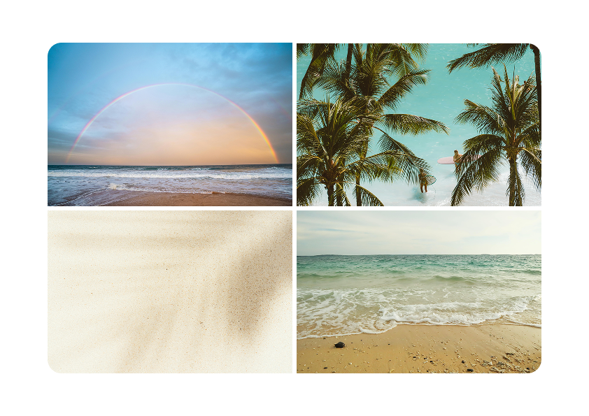
Four photographs of natural seaside scenes. One with a rainbow against the sky above the sea as seen from the shore. Palm trees against a blue sky. The shadow of a palm frond on the sand. The sea at the shore.
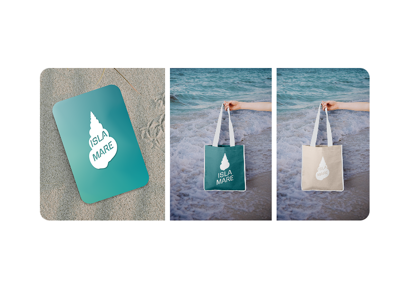
A row of three photographs. The first is a hotel room key card with a turquoise background and a logo in the center in white. The logo is composed of the shape of a seashell with the words Isla Mare in the center in the same color as the background. The second photograph shows a tote bag in the same turquoise with another version of the logo. This one has the seashell in the center with the words beneath at angle. The third photograph is the same style tote bag but in a beige color with the white logo from the first image.